
Image courtesy of Simon Wiffen
One Raw #2
The concept of One Raw is simple – Three photographers receive the same RAW file and are asked to edit it however they see fit using Adobe Lightroom only.
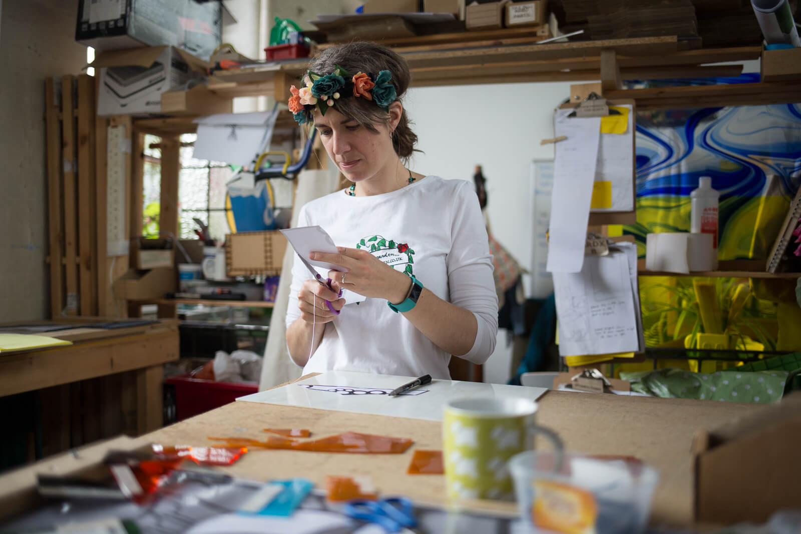
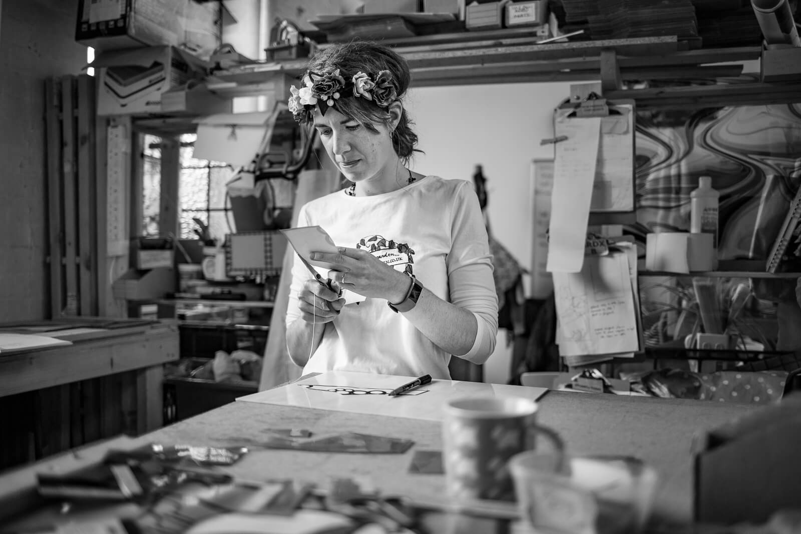
This image is an environmental portrait from a commercial shoot with Zoë Eady, a stained glass artist. (Her work’s great – check it out at http://glassgarden.co.uk) There’s plenty of detail here, with Zoë’s busy studio making up a large part of the frame. Our intrepid editors this time round are Barnaby Aldrick and Phil Marsden, both primarily wedding photographers. They’re joined by Tony Jacobs, a photographer with a particular love of documenting people.
So, one RAW file, three photographers. Let’s go…

Barnaby Aldrick
Barnaby Aldrick is an all-round photographer who specialises in weddings, but also loves a good photo-ramble in the Dales and Lakes, love shooting gigs and snapping pics of food on his dog. He's also quite partial to tweedy attire, a port-finished scotch and a cosy gastropub!
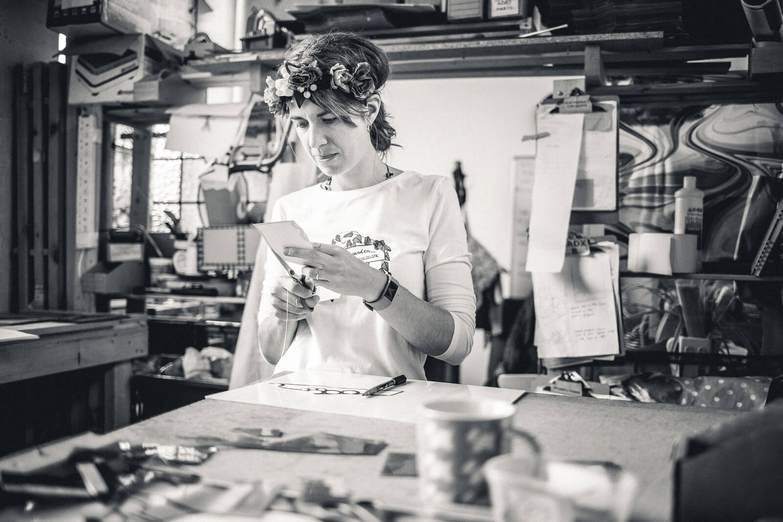
Ok! First thing I found was that – as per the OneRaw rules – I wasn’t able to import this RAW into my Lightroom workflow using the Lightroom ‘import preset’ I’ve tweaked over the years. Almost every frame I edit and output starts life being run through a selective preset I’ve created, based on a VSCO film profile I love, to give all RAWs a tasty bump on import. So importing this bare RAW without any clarity, tone curve clipping and filmic calibration files made it look awful bare!
An initial inspection of the frame was that I liked the composition enough, and the size of the subject in the frame, but found the colours distracting. Lemony books to the left, blue and orange – the colour pallet felt a tad cluttered. So my first reaction was to convert it to default B+W to see how it looked. Flat, but better already.
Next I set about the basic adjustments, a bump in clarity to draw out the edges, a quarter more on the highlights to brighten the whites, +0.75 on the exposure to lift the whole frame, and a bit knocked off the contrast to neutral it out a bit. To draw attention in on the subject I used the vignette tool to darken the edges, then I rotated & cropped the frame to straighten out the lines. I’ve got a thing about wonky lines on horizons, door frames, walls, windows, shelves etc and use the transform tools a lot in my work. The neater the frame, the easier it is to see the photographs intent. This image only really needed a bit of a rotate to get lines in line.
Next I used to brush tool to selectively brighten the subjects face, to help draw attention in – initially adding clarity to help increase the shape, then tweaking exposure, highlights & shadows to subtly lift, soften and enhance the face. Once the majority of my settings are the way I’m happy with I applied an overall sharpen, in line with the settings I might use for a photoshop unsharp mark filter, then Then after a final tweak to the overall crop, I thought the image might benefit from a little filmic grain, to give a slightly less digitally clean feel. So I added a bit of subtle noise to the image. Just a pinch.
Next I set about playing with the individual colour channels of the B+W mixer, tweaking the reds, oranges & blues, to try and find the most pleasing contrast in the image. Reducing or increasing B+W colour channels can completely change skies, or skin tones even when everything’s just in shades of grey. Finally, I decided to use the tone curve to ‘clip the black’ slightly by about 5%. as this means the image has no ’true black point’, and the shadows feel a little less dark.
Once happy with the exposure, toning and drawing the viewers eye, I set about doing a bit of spot healing on the subjects face to remove any distractions (a mark on her nose, and spot on her cheek). It’s subtle, but just saves the attention being drawn where I don’t want it.
A final flourish with B+W images can be to add a split tone. You can choose 2 colours, one to apply to the highlights and one to the shadows, to make it look a bit less grey. I chose a yellowy highlight and a bluey shadow pairing, first turning them up high to find the right shade, then reducing their saturation to almost zero, for a really subtle split tone effect.
And there you have it! A soft & creamy frame, clear of distraction and hopefully easy on the eye.
Drag the slider above to show before/after.
Basic
Tone
Presence
Tone Curve
Region
HSL
Hue
Saturation
Luminance
Color
Red
Orange
Yellow
Green
Aqua
Blue
Purple
Magenta
Black & White Mix
Split Toning
Highlights
Shadows
Detail
Sharpening
Noise Reduction
Effects
Post-Crop Vignetting
Grain
Dehaze
Camera Calibration
Shadows
Red Primary
Green Primary
Blue Primary

Phil Marsden
Phil is a Wedding photographer based in Leeds, who also does Family shoots and event photography. He specializes in natural, candid photography
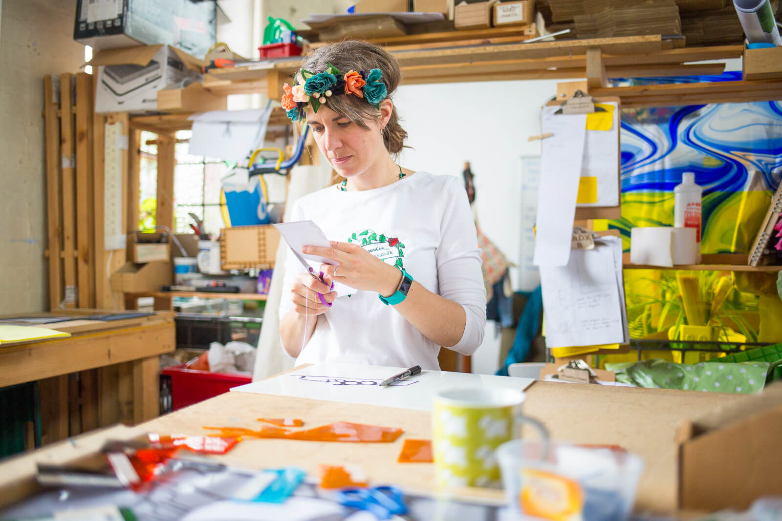
Knowing the subject of this photo worked with stained glass I had a very clear vision going in to the edit. I wanted the photo to be bright and colourful to reflect the glass being produced.
First off just to say, I would usually crop an image a little, but I felt the original RAW captured the studio well. It is a busy place full of character and I wanted to keep all that in.
I usually add one of of my own user presets and work from there since most of my jobs include thousands of photos to edit, so this was an enjoyable experience starting from scratch. The first tweak I made was to increase the Exposure to just past 1, also taking shadows to +45 to further increase the light and open feel, whilst also reducing highlights (because I never do an edit without fiddling with highlights).
Next I added a touch of contrast just to lift the image a bit, and got to work making everything more vibrant. I have upped vibrance to 21 and increased overall saturation by 10. Then in the HSL (hue saturation luminance) I upped orange, blue, green, yellow and aqua further still, again trying to mirror the colourful stained glass.
Lastly I increased Sharpness (amount and detail).
I stopped there. With this project I saw myself feeling the need to keep adjusting everything just so I could say I had, but the RAW does it’s job and I didn’t have to make a whole lot of changes to achieve what I wanted.
Drag the slider above to show before/after.
Basic
Tone
Presence
Tone Curve
Region
HSL
Hue
Saturation
Luminance
Color
Red
Orange
Yellow
Green
Aqua
Blue
Purple
Magenta
Black & White Mix
Split Toning
Highlights
Shadows
Detail
Sharpening
Noise Reduction
Effects
Post-Crop Vignetting
Grain
Dehaze
Camera Calibration
Shadows
Red Primary
Green Primary
Blue Primary
Tony Jacobs
After losing his mind long ago in the creative agency scene, Tony decided to swap his phone camera for a 'proper' camera three years ago with a view to learning new skills and to seek sanity in documenting the life of others. But seriously, he's somebody who has always enjoyed people watching and his photography is simply an extension of that. He's delighted that it's something that has introduced him to so many new opportunities and great people.
As somebody who’s always enjoyed what black and white can bring to a story, it’s a route that I’ll often take when editing, though obviously it isn’t suitable to every image.
My edits in this image have been made to draw further focus to the subject, essentially increasing the contrast a little in the areas where the subject and background have similar tonal values.
Overall image edits include decreasing highlights, increasing shadows for a more neutral tone and to reveal some detail in shadow areas, and to increase clarity overall a little as well as increasing the orange hue in the black and white mix palette. In this image that primarily lightened the skin tone a touch.
I’ve then gone about addressing any issues that those general settings brought about, by working with brushes to work on each area in isolation.
Brushes have been used to lighten some of the shadow areas in the face to reveal further detail there, and increased clarity around her hands to further draw focus to what she’s doing.
Adding a very small amount of vignette again helps to frame the subject.
Drag the slider above to show before/after.